My favorite MacOS Menu Bar Apps

(Initially posted December 6, 2023 on LinkedIn)

I’ve posted before about my love for Maccy, a clipboard editor that lives on your menu bar. A new computer this week made me re-evaluate my menu bar (thanks, new MacBookPro notch), and I realized have a couple of apps up there that I really enjoy and figured it was worth the share!

First up is PingStatus (Free). PingStatus shows my real-time latency to Google. Having this up on my menu bar is extremely helpful when a video call starts to sound like autotune and I can confirm if it’s my internet or someone else’s.

It’s pretty customizable, allowing you to change the host, interval, timeouts, etc. From a menu bar perspective, it gives you the option to show just your latency, an icon or both based on the thresholds you set.

(screenshot of “PingStatus” configuration)

Next up is WattsConnected (Free). Similar to PingStatus, this shows the input wattage to my Mac. This will eventually get relegated to my “hidden” Menu Bar apps (more on that later), but for now, it’s been fascinating to see the wattage various docks and USB-C adapters are outputting. I went from a 30W MacBook Air to a 70W MacBook Pro so having an idea of the wattage of each adapter is helpful.

Concluding this little walk through my current menu bar, the last app is Bartender ($16). Bartender hides menu bar apps you don’t like and gives you insane customization and triggers, like “when I plug in my mac, show me the battery icon.” Simply click on the empty space on your menu bar and the rest of the “hidden” icons appear:

(what my menu bar looks like when I expand it)

I’m only beginning to scratch the surface of what Bartender can do, but it immediately made using my menu bar 10x better. Shout out to Gregory Baltes for the recommendation on this one.

What are your must-have menu bar or Mac apps?

Domo Tricks: Dataflow Archiving

(Originally posted October 10, 2022 on Linkedin)

Everyone’s done it. You’ve built out some incredible dataflow that will revolutionize the way your organization operates and 100x the revenue. Fast forward a year, and you’re somehow the only card viewer and have millions of rows hanging out in your Domo instance not being used.

Data Governance and regular clean-ups are an important part of keeping your Domo instance user friendly and compliant. However, there’s sometimes value in keeping the business/dataflow logic and not the extra unused data.

Screenshot of dataflow named "Production | Amazing 100x Revenue Idea"​ with 8 million rows last used 1 year ago

If you’ve labored over the dataflow and business logic but the dataset isn’t being used and you’re sick of the millions of unused rows, consider implementing a standard dataflow archiving process in your instance as part of your governance procedures:

  • Rename the dataflow/datasets and add an “Archive” description, or whatever makes sense based on your organization’s naming conventions (i.e., “Archive | Amazing 100x Revenue Idea”). I’d also add a description to the dataflow and dataset that explains that it has been configured to output zero rows.
  • If your organization utilizes tags, add an #Archive tag.
  • Remove any schedules so the dataflow stops running on a schedule or when the input datasets update.
  • Configure the dataflow’s outputs to return zero rows, which can easily be done in both MySQL and Magic dataflows:

MySQL

In the final output(s), add some nonsense logic that will never be true in your where clause. I’m impartial to “where 1 = 0:”

SQL statement "Select * from profit??? where 1 = 0"​

Magic ETL

The core logic is the same in Magic ETL as it is in MySQL dataflows. In order to output zero rows in your Magic ETL datasets, add a filter tile right before your output dataset(s) and populate logic in your filter formula that will never equate to true:

Filter tile that says "excel = best enterprise data tool"​

Run the dataflow one last time, and it will return datasets with zero rows. You still have the business and dataflow logic if the project gets revisited, but it’s not taking up valuable rows in your Domo instance.

What are other hashtag#DomoGovernance tips and tricks you have?

Living your best Data life (Lessons Learned from Roller Coaster Tycoon)

(Initially posted July 17, 2019 on LinkedIn)

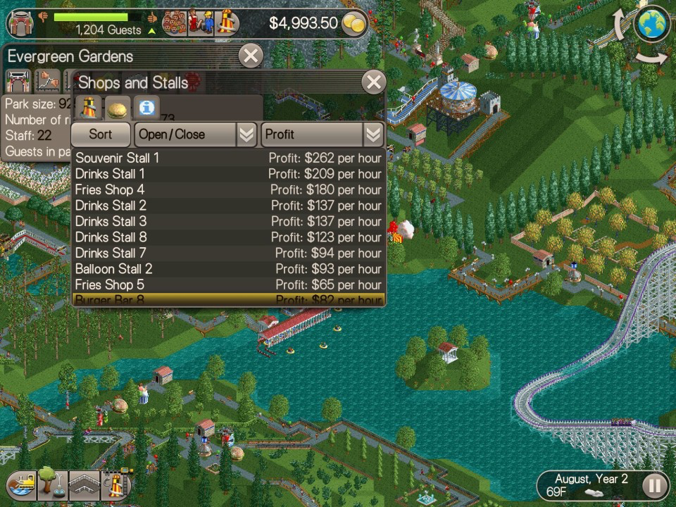
Growing up I loved playing Roller Coaster Tycoon. I’d pop the Age of Empires II out of the drive, slip in the shiny Roller Coaster Tycoon CD and suddenly I’m Walt Disney. Then I relied on feelings and observations to guide my park-running decisions. I’d see a long queue line and see that Go-Karts is popular and decide to build another. I’d feel like my guests wanted a bathroom in a certain spot (I made drinks free and bathrooms cost $15) and drop one there. I’d see that Alan S is lost and personally intervene by picking him up and dropping him back on the path.

I picked up this game as an adult on for my iPad and my approach is entirely different. As a kid, I didn’t even know I could open up the “Thoughts” tab or see exactly how a stall or ride is doing. I’m constantly opening up the financials for each stand or ride, playing with the prices, trying to figure out supply and demand for a certain item or ride. As I started to consume this data, I immediately wanted a better way to organize and slice and dice it. I wanted to be able to track price and sales over time and drill down to the lowest granularity. I wanted more data. Yes, now I know that “Information Kiosk 4” is my highest selling kiosk but is that because of the location? The prices? The umbrella colors?

Companies that aren’t data-driven and not managing by exception are doing the exact same thing as 10-year-old Bryan (although hopefully, not charging $15 dollars for bathrooms). They will be reactive to problems, driving their company entirely by feel and observations and building a second go-cart track instead of raising the prices. They’re putting out fires that should have been settled 3 weeks ago. They’re reporting off of stale data, lost customers and broken-down rides.

Data-driven companies are the adult Bryan. They’re using data in real-time to make decisions, getting alerts that people are getting confused and fixing the sidewalks before Alan S even complains. They’re tracking trends and getting alerts on their phones when things fall out of exceptions. They’re not getting 10-page reports listing all sales, they’re getting an alert when Information Kiosk 4 is having an incredible year and can drill down immediately and see why.

Who are you? Are you out there building more go-carts or actually using data to drive your business forward? 

Beware of the Swiss Army Report

When my fiancé visited Switzerland to finish her MBA she brought me back a Swiss Army knife. This knife stays in my bag and I use it all the time to open amazon packages, quickly unscrew things or open bottles. While I love the versatility of such a tool, it doesn’t actually excel at any of these tasks. Assembling furniture is easier with a screwdriver and you’ll never see a bartender on a busy night opening bottles with a multitool.

The same can be said for building effective Business Intelligence (BI) charts. Many new report builders tend to jam a single chart full of information, especially when given a new BI tool to play with. “Look! This chart shows X, Y, Z and the colors show A, B, C!” And while that chart may show those all of these things, it doesn’t do them well.

A good chart will tell you a story and help guide business decisions. It will be clear and concise and the reader should be able to immediately gleam what the chart is showing you with a quick glance. The longer you look it should provide additional insights to the overall narrative but not provide unrelated or unnecessary information.

Tips for avoiding a Swiss Army Chart:

  1. Use the appropriate chart type for the data you are trying to show.
  2. Make your chart answer one business question at a time.
  3. Provide a thoughtful summary that includes the business question.
  4. Drill-downs should provide more specificity to the answer and help answer the overall question.
  5. Label the axes so the reader is immediately aware of what they are looking at.

Follow these tips to start building screwdrivers and bottle openers and keep the multi-tool in your bag!

Ch-Ch-Changes

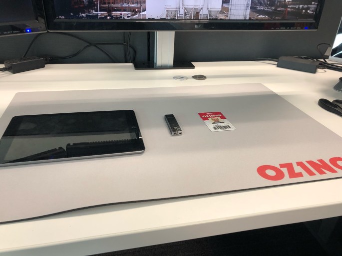
Today was my last day at Ozinga. I started here 7 years ago as the 7th member of the IT Team as a “PC Support Manager.” At the time we supported 30 Redi-Mix locations across two states and a small number of fledgling support businesses.

Now as I pack up my desk, I leave as a Data Architect and one of 30 people in IT. This department has splintered into four very separate teams in order to keep up with the rapid growth of the business. The number of Redi-Mix locations is over 80 across four states and all of the “fledgling support” businesses have grown into powerhouses in their own industries. I’ve seen the ownership transition to the next generation and every division/department grow immensely as they keep up the entrepreneurial spirit Ozinga was founded on.

It’s been an amazing start to my career and I will forever cherish the experiences, knowledge, and friendships I’ve made during my time here. I could not have asked for a better first “real” job.

Carpe Legatum, Ozinga. Carpe Legatum.